
Creating a visually appealing banner doesn't have to be complicated. We often think we need super-advanced programs or a professional designer, but the truth is that PowerPoint, the program we use for presentations, can be a powerful tool for making amazing banners. In this guide, we'll show you how to make banners in PowerPoint quickly and easily, transforming your ideas into eye-catching graphic pieces without any hassle.
Key Points
- To start creating your banner in PowerPoint, open a blank presentation and adjust the slide size to your desired dimensions.
- Use the 'Design' tab to change the slide background, inserting images or solid colors to create the base of your banner.
- Add text using text boxes, choosing legible fonts and colors that contrast well with the background.
- Explore the 'Insert' options to add images, shapes, and icons that complement your banner design.
- When finished, save your banner as an image (JPG, PNG) or PDF via 'File' > 'Save As' to use wherever needed.
Preparing the Ground: Setting Up Your Banner in PowerPoint
Before you start unleashing your creativity, the first step to creating a cool banner in PowerPoint is to get the basic settings right. Think of it as preparing the canvas before painting. If you skip this step, you might end up with a banner that's not the right size or doesn't fit where you want to use it.
Starting a New Blank Presentation
To begin, open PowerPoint and choose the option to start a blank presentation. This gives you a clean sheet, without any predefined templates that might limit you. It's the best way to have complete control over the design from the start. This way, you don't have to worry about deleting elements that come with a template.
Adjusting the Slide Dimensions to the Ideal Size
This is the most important part to ensure your banner has the format you need. Go to the "Design" tab and look for "Slide Size". There, you can choose "Custom Slide Size".
Here, you can set the exact measurements in centimeters, inches, or another unit of your choice. Think about where this banner will be used: is it for a website? A print job? Each place has its ideal dimensions. For example, for a website banner, you might want something wider and shorter, while for a poster, it might be more vertical.
- Width: Set the desired value.
- Height: Set the desired value.
- Guidance: Choose between Portrait (vertical) or Landscape (horizontal).
Remember that when you resize, PowerPoint may ask if you want to maximize or ensure the content fits. Generally, for banners, you're creating them from scratch, so the "Ensure Fit" option might be more useful if you've already added something, but if you're just starting out, it might not make much difference.
Defining the Slide Orientation: Portrait or Landscape
Within the "Custom Slide Size" options, you also choose the orientation. Most banners, especially those used online, are in landscape format, meaning they are wider than they are tall. However, if your banner is for a specific context, such as a vertical social media post or a specific display, portrait orientation might be the best choice. Carefully consider the end use to define this correctly. A wrong choice here could mean your banner will be cut off or have unwanted empty spaces. It's a simple detail, but it makes all the difference in the final result. If you have any questions about this... How to customize themes In PowerPoint, this scaling step is a good starting point for understanding the control you have over the layout.
Bringing Your Banner to Life: Essential Visual Elements
To make your banner truly eye-catching, it's time to think about the visual elements. There's no point in having a clear message if it's hidden in a bland design, right? Let's make it more interesting.
Adding Striking Background Images
A background image can set the entire mood of your banner. Think of something that matches the theme and doesn't clash with the text you'll put on top. If you're using a photo, make sure it has good resolution so it doesn't become pixelated. Sometimes, a smoother background or one with a subtle texture works better to highlight the main content. You can explore... Versatile templates for creating presentations which can also serve as inspiration for funds.
Inserting Relevant Images for Illustration
Additional images help tell the story or reinforce your message. They can be photos, illustrations, or graphics. The secret is to choose images that complement the text and background without cluttering the visual. If you have a product to showcase, a high-quality photo of it is essential. If it's an event, perhaps a photo of the venue or previous editions would work well. Remember: less is more. One or two well-chosen images are worth more than a bunch of random photos.
Using Graphic Shapes for Visual Details
Geometric shapes, such as rectangles, circles, or arrows, can be used in a variety of ways. They can serve to highlight important information, create visual divisions between banner sections, or simply add a design touch. For example, a rectangle with a solid color can serve as a block to place short, eye-catching text, ensuring it stands out. Experiment with different colors and opacities to see what works best for your design.
Content That Communicates: Working with Texts
It's time to give your banner a voice, and text is the main channel for that. But it's not just about throwing words on the screen, you know? How you present your message makes all the difference. Let's see how to do it right.
Adding Text Boxes for Key Messages
To begin, you'll need text boxes. These are like the boxes where you'll write your ideas. In PowerPoint, it's super simple: go to "Insert" and then "Text Box". Click where you want it to appear and start typing. Think about the most important messages your banner needs to convey. They should be short and direct. There's no point in filling the banner with text; nobody will read it all.
Formatting Fonts for Maximum Readability
Now, let's talk about the appearance of these words. The font you choose and its size are crucial. A very elaborate font might be beautiful, but if no one can read it, what's the point? For banners, the ideal is to use clear and easy-to-read fonts, even from a distance. Think of something like Arial, Calibri, or Open Sans. And the size? Never use fonts smaller than 24 points for the main text. If it's a title, it can be longer, of course. But the body text needs to be legible.
Choosing Harmonious and Contrasting Color Palettes
Colors speak volumes, and in your banner, they need to work together. A good color palette helps to highlight the text and create a visual identity. The secret is... contrast. If your background is dark, use light text. If the background is light, use dark text. This ensures the message is effortlessly visible. Avoid mixing too many different colors, as this can make the banner look cluttered. Think of two or three main colors that go well together and use them consistently.
Clarity is your best friend when creating a banner. If the text is difficult to read or the colors clash, the message is lost. Less is more, and readability comes first.
Optimizing Design: Tips for a Professional Banner
Creating a cool banner in PowerPoint is one thing, but making it look truly professional is another story. There's no point in having a lot of information if nobody can read it or if the visuals are confusing, right? Let's see how to give your banner that touch of sophistication.
Avoiding Very Small Sources
This is a classic. We get carried away with the design and end up putting in tiny text that, on the computer screen, is readable, but when the banner is viewed from afar or printed, it becomes a blur. The golden rule is: if you can't read comfortably at arm's length, it's too small. Think about who will see your banner. They need to understand the message quickly. Use fonts that are legible even at smaller sizes, and always test the final size.
Ensuring Visual Consistency Across the Entire Banner
A professional banner looks like it was designed as a whole, not as a bunch of pieces glued together. This means using the same fonts (or a limited and harmonious set of them), the same colors, and a similar image style throughout the design. If you used a filter on one photo, try using something similar on the others. If you chose a color for the titles, stick with that color. consistency It helps create a strong and trustworthy visual identity for your banner. It's as if everything is speaking to each other.
Moderate Use of Animations and Effects
PowerPoint has a lot of cool effects and animations, and it's tempting to use them all. But for a professional banner, less is more. Overly elaborate animations can distract the audience from the main message and make the banner look amateurish. If you're going to use animation, keep it subtle and help highlight something important, like a call to action. Consider whether the effect truly adds value or is just there for show. For a cleaner look, it's often better to leave it blank. If you're aiming for a cleaner, more professional look, you might want to explore tools that help remove image backgrounds, such as those found in [website/platform name - implied from context]. CapCut Online.
Clarity is key to effective design. A successful banner communicates its message directly and without ambiguity. Prioritize legibility and visual organization so that the viewer can absorb the important information effortlessly. Remember that first impressions count, and an organized design conveys professionalism and credibility.
Exploring Advanced PowerPoint Features
PowerPoint isn't just about putting text and images on a slide, you know? It has a bunch of tools that can give your banner a professional touch, even if you're not a certified designer. Let's take a look at some of them.
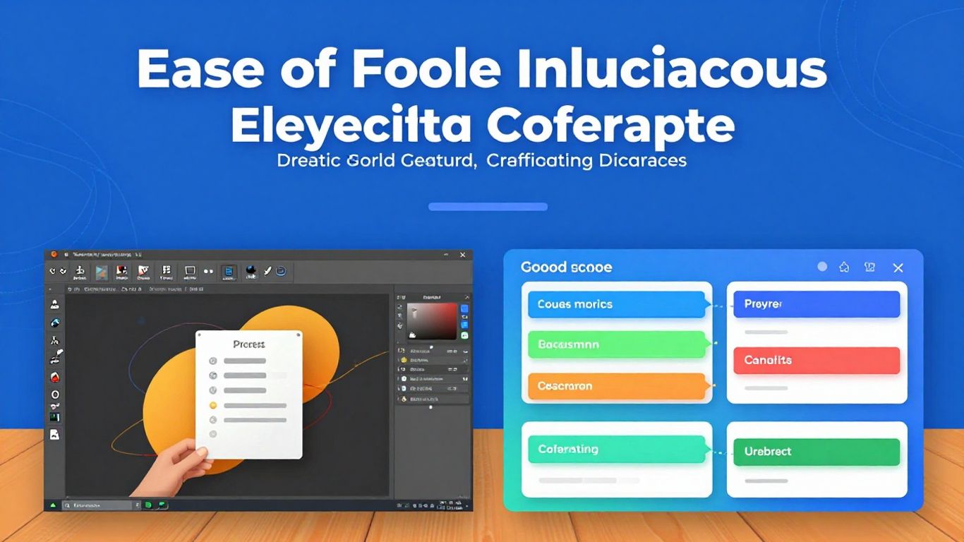
Using PowerPoint Designer for Layout Suggestions
You know when you add an image and PowerPoint just suggests a bunch of different ways to arrange the text and the image? That's the Designer. It's like a visual assistant that looks at what you've put on the slide and thinks, "Hmm, I think this would look better!" It suggests layouts, color combinations, and even matching icons. It's a lifesaver for anyone who wants a cool look without having to think too much about design. It helps keep everything looking consistent, preventing your banner from becoming disorganized.
Incorporating Graphic Elements and Icons
Icons are great for representing ideas quickly and visually. Instead of writing a paragraph, an icon can say it all. PowerPoint has a really cool library of icons you can use. They are vector-based, so you can change the size and color without losing quality. Use them to highlight important points or to provide a visual break amidst so much text. It's a simple way to make your banner more... dynamic.
Inserting 3D Models for Complex Demonstrations
This is for those who really want to impress. If your banner needs to showcase a product, a technical concept, or something that benefits from a three-dimensional view, PowerPoint now allows you to insert 3D models. You can rotate these models during the presentation, showing all angles. It's something that really grabs attention and can be a differentiator, especially in areas like engineering or product design. For a banner, it might be a bit excessive, but it's good to know that the tool exists for when you need something truly impactful.
Saving and Exporting Your Banner
The time has come to give your creation its final destination. Saving and exporting your banner in PowerPoint is a fairly straightforward process, but it's important to know the options to ensure the final result is exactly what you envisioned.
Saving options: File and Save As
When you finish designing your banner, the first thing that comes to mind is saving your work. In PowerPoint, you go to the "File" menu in the upper left corner. There, you'll find two main options: "Save" and "Save As".
- Save: If you've already saved the file before, clicking "Save" will only update the most recent version of your banner, keeping the original name and location.
- Save As: This option is more versatile. It allows you to choose a new name for the file, a different location to save it, or even change the file format. It's ideal for creating copies or when you want to save the project in a specific place.
Remember that saving the file in PowerPoint's native format (.pptx) allows you to edit the banner later if you need to make any changes.
Exporting as Image or PDF Formats
To use your banner elsewhere, such as on social media, websites, or for printing, you need to export it in a suitable format. PowerPoint offers several options:
- JPEG (.jpg): Great for web use and presentations. It generally has a smaller file size, but may lose some quality in images with a lot of detail.
- PNG (.png): Ideal if you need a transparent background (useful for overlaying the banner on other images) or if image quality is your top priority. PNG files tend to be larger.
- PDF (.pdf): Perfect for documents that need to maintain precise formatting, such as brochures or print documents. Ensures that the layout and fonts remain consistent across all devices.
To export, use the "Save As" option and, in the window that appears, choose the desired file type from the "Save as type" drop-down menu.
Sending Directly to Print
If your goal is to print the banner, PowerPoint also makes this process easy. After adjusting the slide dimensions to your desired print size (such as A4, A3, or custom sizes), you can go to "File" and select "Print".
On this screen, you can choose the printer, the number of copies, and other print settings. If you saved the file as a PDF, you can open it with a PDF reader and print from there, which often gives you more control over print options, especially for larger formats.
It's always a good idea to check the print settings to make sure the banner comes out with the expected quality and size. Sometimes it's worth printing a test page before sending the final banner to a print shop.
Alternatives and Add-ons for Banner Creation
PowerPoint is great for beginners, but sometimes you want something more, right? That's where other tools come in. Think of them as helpers that can add a special touch to your banner.
CapCut Online: A Complementary Tool
CapCut Online is a very interesting option for those who want to go beyond the basics. It's known for video editing, but its image tools are quite powerful. If you want a more polished look, CapCut can be a great partner to PowerPoint. It makes it easy to create eye-catching designs, you know?
Image Enhancement with Upscaling and Background Removal
Do you know that image that doesn't have the quality you expected? CapCut has a feature called 'upscaling' that can improve sharpness and colors. It's like giving your photo an 'upgrade'. And background removal? That's a lifesaver! It makes your graphic elements look more professional, without that annoying white background. You can remove the background from an image and then paste that edited image into your PowerPoint banner. It looks much cleaner.
Creative Text Overlay in CapCut
Another great thing about CapCut is how you can play around with text. It offers more freedom to experiment with different fonts, sizes, and styles. If you want your text to really stand out, CapCut can help you create something more creative than PowerPoint alone. It's good for when you have a short message but want it to have a big visual impact.
Using complementary tools like CapCut can transform a simple banner into something truly eye-catching. Don't be afraid to mix what PowerPoint does well with the extra features that other platforms offer. The end result might surprise you.
Leveraging Artificial Intelligence in Design
You know that feeling when PowerPoint is a step ahead? Well, artificial intelligence (AI) is largely responsible for that. Tools like Copilot and Designer aren't just a luxury; they're changing the way we create our banners and presentations. They transform time-consuming tasks into fast and intelligent processes.
The Role of the Copilot in Content Creation
Copilot is like having an assistant that understands what you want to say. You give it an idea, a draft, or even a simple command, and it starts generating text, titles, and key points. This is especially useful when you're starting a banner from scratch and don't know where to begin. It helps structure the main message, transforming your ideas into a ready-to-work-on outline. It's a lifesaver for anyone who needs quick and well-organized content.
How PowerPoint Designer Helps with Visuals
Once the content is more or less in place, the Designer comes in. This tool is a design genius. It looks at your text and images and suggests layouts that match. You know when you spend hours trying to align text boxes with photos and nothing looks good? The Designer does that in seconds. It proposes different visual styles, color combinations, and even the arrangement of graphic elements. The result is a more professional look, without you needing to be an experienced graphic designer.
Review and Personalization of AI-Generated Content
Of course, AI doesn't do everything on its own. What it generates is a starting point. It's crucial that you review and customize everything. The Copilot might have suggested text that doesn't sound exactly like you speak, or the Designer might have proposed a layout that, while beautiful, doesn't perfectly fit your message. Think of these resources as a creative partner. They speed up the process and provide ideas, but the final touch, your voice and your style, come from you. Adjust the fonts, change the colors if necessary, rearrange the elements. It's this combination of AI efficiency and your vision that creates a truly impactful banner.
Conclusion: Your Banner Ready in Minutes!
There you have it! See how easy it is to make a cool banner using PowerPoint? You don't need to be a professional designer to create something eye-catching. With these tips, you can quickly put together your promotional materials, whether for an event, a promotion, or anything else. Remember that the important thing is to make your message clear and the visual appeal pleasing. Now it's just a matter of getting to work and enjoying the results!
Frequently Asked Questions
Can I create a banner of any size in PowerPoint?
Yes! PowerPoint allows you to adjust the slide size to any dimension you need. Just go to 'Design', then 'Slide Size' and choose 'Custom Slide Size' to enter the correct measurements.
How can I make my banner look good with images?
To make your banner even cooler, you can add background images or other images to illustrate it. Go to the 'Insert' tab, click on 'Images' and choose what you want. If you want to change the background, go to 'Design' and 'Format Background'.
What are the best fonts to use in a banner?
Choose fonts that are easy to read, even from a distance. Avoid very thin fonts or those with lots of detail. Generally, fonts with straighter, thicker letters work best. And remember not to use very small sizes; ideally, start at 24 points.
Can I use different colors in my banner?
Sure! You can choose the colors that best match what you want to show. The important thing is that the text colors stand out well from the background so that everything is easy to read. PowerPoint can also give you suggestions for cool colors.
What is PowerPoint Designer and how does it help?
The Designer tool is a smart PowerPoint feature that gives you ideas on how to make your slides more attractive. It suggests layouts, color combinations, and images, helping you create a stylish and professional look without needing to be a design expert.
How do I save my banner to use elsewhere?
After you're finished, go to 'File' and choose 'Save As'. You can save it as an image (such as JPG or PNG) to use online or on social media, or as a PDF if you need higher quality or for printing.
Are there any other tools I can use alongside PowerPoint?
Yes, tools like CapCut Online can complement PowerPoint. It's great for editing images, removing backgrounds, or adding text creatively, which can make your banner even more special.
Can artificial intelligence help me create the banner?
Absolutely! Tools like Copilot and PowerPoint Designer use artificial intelligence to generate content ideas and layouts. This can greatly speed up the process and give you an amazing starting point for your banner.